The Arsenal Kit Dopeness Index – 2020-21 Away Kit
The 2020-21 Arsenal away kit dropped on Thursday, although not as part of an announcement that Aubameyang had extended or that Gabriel had finally signed for the club. But those things should happen any day, right? (Right???) The away kit was showcased in an Adidas ad that ran slightly under two minutes and appeared to be put together by the team that did the opening credits for Game of Thrones. The video took us on a rather psychedelic tour of Highbury, escorting us through its marble halls past wall art depicting two of Arsenal’s greatest-ever players and Eddie Nketiah, the 3D-chess board Arteta was playing on when he bested each of this year’s top four, and a gallery of regal portraits of current Gunners. Among those portraits was a painting of Kieran Tierney holding a not-Tesco bag for purposes of avoiding an intellectual property lawsuit and wearing one of those IKEA rugs you’d see draped around the shoulders of the Night’s Watch. The continued GoT theme here is quite apt, as the first half of last season regularly felt like it had been produced by David Benioff and D.B. Weiss. At the end of it all, the new away kit was revealed. And almost instantly, the debate about how good the kits looked began to rage.
And so the Arsenal Kit Dopeness Index makes its triumphant return. If you aren’t familiar, the Arsenal Kit Dopeness Index (AKDI) is a cutting-edge evaluation system that empirically determines on a scale of 0-30 just how objectively dope an Arsenal kit is. No longer do Gooners have to guess at how good a kit is. Gone are the days of just not being sure whether the 2016-17 third kit is worse than the 2016-17 away kit (for the record, it’s not, I would take black with neon green trim over a knock-off Wolves jersey any day and I have the documentation to prove my opinion on the matter is correct). Time wasting involved with any of these determinations is a thing of the past. The AKDI eliminates all of these inconveniences, efficiently converting a kit’s dopeness into a numerical value to then be easily compared against other kits’ values.
The Friday Injury Tracker
Who's out, who's back and what it means for the next two games.
In case you haven’t seen the AKDI in action, here’s how it works: an Arsenal kit is evaluated with regard to three equally weighted factors. Each factor has a maximum value of 10. The kit’s scores for each factor are then added up, giving us the total, or the Dopeness Value (DV). The factors used by the AKDI to produce a Dopeness Value are:
Traditionalism. First and foremost, Arsenal is a club that values tradition. We have a way of doing things, we have a standard of class we hold ourselves and our club to, and we have a general philosophy about how the game should be played. We also have a general pattern our home kits conform to. You know the one: red body and white sleeves. It’s a classic, it’s iconic. That’s what we look for from typical home kits. For away kits it’s a little more loosey-goosey, although generally we expect those to be yellow or blue. But additionally, we’re looking for how much tribute the shirt pays to the club here. Is the kit just designed to look cool, or does it aim to honor the Mighty Arsenal as well?
Innovation. Tradition is very important. But year after year of strict adherence to tradition gets boring. With this category, we look at how bold a kit’s design is within the confines of what we expect an Arsenal kit to look like. Where do the stripes go? Has anything interesting been done with the badge? What did they put on the back of the jersey? Did they fade the image of Theo Walcott taunting Spurs fans from a stretcher about Arsenal beating them 2-0 onto the body of the shirt (which would be an automatic 10)? Essentially, this category judges whether a kit simply sticks to the script or attempts to reinvent a classic.
Style. Lastly, perhaps the most important thing you’re thinking about when trying to decide whether to buy a kit. It’s also the most straightforward factor in the AKDI. How fresh is the kit? A dope kit looks good on and off the field. It should look just as amazing on someone at the club (the music and drinks and dancing kind, not the football kind) as it does on Aubameyang when he’s slotting home his 20th of the season. All the traditionalism and innovation in the world cannot save a kit that looks bad.
If you want to see the AKDI in action, it has previously calculated a Dopeness Value for the 2020-21 home kit. But since this is likely the first time you have seen the AKDI at work, you will probably need a demonstration of its scientific excellence before we can apply the system to the new away kit. So below is just that. Watch and behold.
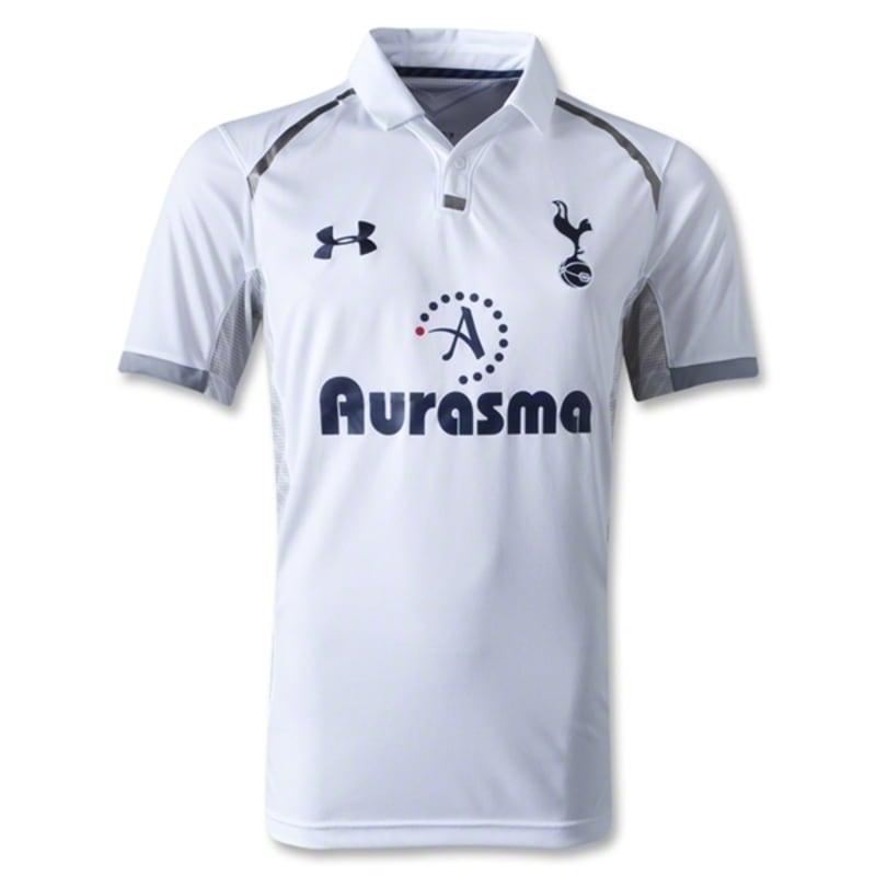
Traditionalism: Changing up the white sleeves is one thing, but getting rid of the red body?? There’s no red to be found anywhere on this kit, aside from one random dot in the kit sponsor’s logo. And where is the crest?? In its place is just some sad-looking rooster balancing on a football! Nothing on this shirt is even remotely reminiscent of Arsenal. Score: 0/10
Innovation: It’s just a white shirt with a couple dark blue lines on it. If we’re talking undershirts then this may be a bit bold, but in terms of kits this is about as innovative as cutting a hole in a trampoline. Score: 0/10
Style: Pfftttt, Under Armour? Who are we, that one divorced uncle who keeps trying to flirt with women half his age at the gym? And that collar is just begging to be popped to complete this kit’s douchey look. No thanks. Score: 0/10
Dopeness Value: 0/30. This is horrendously not dope. Even thinking of spending money on such a ghastly garment is utterly diabolical. Bring it to life and then kill it with fire, please.
See? The AKDI works like a charm! And with that fact being proven, it is time to use it on the new away kit and see once and for all how dope it truly is.

Traditionalism: At first, this kit seems rather untraditional. We’re used to yellow or blue away shirts. While the new century has seen Arsenal wear white away here and there, this looks like a Real Madrid kit that accidentally got thrown in an old washing machine with some tie-dye shirts. But the press release for the kit sheds light on its appearance:
The shirt unites generations with a design that represents the famous marble halls of Highbury’s iconic East Stand. Built in 1936, the facade of the East Stand remains in place after our 2006 move to Emirates Stadium, providing a permanent reminder of The Arsenal’s storied past.
Adidas has clearly done their homework. As a result, they are demonstrating a commitment to Arsenal’s traditions and history that is quite refreshing. Here, they have produced an Arsenal kit that is literally supposed to resemble the marble halls you would walk through to watch the Arsenal play at Highbury. It is a phenomenal callback to the club’s previous home. Whether they are in Manchester, Liverpool, or elsewhere in Europe, Arsenal will be taking a piece of Highbury with them to some of their away matches this coming season. And as with the home kit, the club’s original crest and the lettering from Arsenal’s previous badge will be visible on the back. While the shirt veers slightly from the traditional away look, it more than makes up for it with this design that honors where our club comes from. Score: 8/10
Innovation: In that same vein, this is quite a bold kit. The departure from the traditional yellow or blue is one thing. But making the shirt itself look like the marble of the East Stand is a courageous venture. After all, the kit could have been left a blank, solid color. However, the red streaks that run through it make it stand out like few previous away kits have. Unlike with the home kit, the three stripes customary for an Adidas strip have been removed from the sides of the kit, remaining only on the shoulders. The kit designers have refused to hide even a portion of the marble design, baring it on the entirety of the front of the shirt for all to see. Additionally, the color has been removed from the badge, leaving a brilliantly quartz-like badge sitting atop rivers of red. It’s an unabashedly inventive kit. Score: 9/10
Style: The fact of the matter is, this is also a pretty clean kit. The black lettering on an eggshell background, the alabaster-like appearance of the badge, the black stripes on the shoulders, and yes, the red streaks. They make each kit look like beautiful wearable slabs of marble. Some may say the shirts look like tubs of raspberry swirl ice cream. But imagine for a minute that we’re playing Manchester United. It is absolutely pouring. And the team that is by far the greatest the world has ever seen is up three-nil. Do those streaks resemble artificially-flavored raspberry ice cream now? Or do the players suddenly look like regal warriors drenched in the blood of their enemies (except for Harry Maguire since fridges don’t bleed)? And yet, for all the gritty Westerosi gallantry one could see the 2020-21 away kit involved in, the strip also strikes a note of elegance. After all, it is meant to look like marble floors. It is in no way formal attire, but as was the case with the home kit, and perhaps even more so, this is a jersey that could be paired with other pieces to create a very fashionable ensemble. Adidas seem to operate with the aim of creating Arsenal kits that can be worn more often than just at matches or in front of the TV. And so far, they have been very successful. Score: 8/10
Dopeness Value: 25/30. The Arsenal 2020-21 away kit is extremely dope, and just short of being elite. It is one of those Arsenal shirts that look better with each time you lay your eyes on them. It could be more dope, of course. The red veins don’t feature much on the back of the kit, creating an odd, giant blank space. The off-white base color of the jersey might remind some of a Spurs kit. But aside from those concerns, there isn’t much that prevents the new away kit from being objectively dope. But if Arsenal ever want to further sweeten the deal, they could always throw in a bobble head of the naked David Seaman statue.
If you enjoyed this article, follow me on Twitter at @dopegooner for more Arsenal thoughts and opinions.
The Friday Injury Tracker
Who's out, who's back and what it means for the next two games. Free, in your inbox every Friday.